Final Reflection

1.  HUE refers to the particular color, a name that would identify a specific color.  For example, Crayola has some great hues like “Macaroni & Cheese”.  Although it’s probably some kind of yellow-orange-yellow, it’s easy to explain and identify with a specified name for that exact hue.  The color wheel project helped me learn about hue since we had to mix and paint specific colors for the wheel.

SATURATION refers to the brightness of a color.  The brighter a color, the more the it is saturated with color.  With the emphasis project I used saturation to help emphasize the seahorse.  The colors directly surround it are less saturated and the seahorse is very saturated, allowing it to more vividly stand out from it’s background.

VALUE refers to the lightness/darkness of a color.  The very first project allowed us to see how many different values there actually are.  Never again will I think of gray as one color (more like 75 colors atleast).  The 10-line composition really racked my brain with value.  It showed me how to understand that colors are essentially composed of either white+color or black+color, which definitely changes if the color is light or dark.

2.  I think I learned the most from the 10-line composition and the transparency problem.  I had a pretty tough time with the 10-line composition project.  Deciphering what value a color is in terms of actually finding that value in the grays was so hard!  I think that if I went back today I would do a better job though and I do think I learned a lot.  It’s something you don’t think about when you watch black and white movies or take black and white pictures, but it’s a prevalent concept and would be powerful to have the ability to change a color scheme into pure value when designing.

Finding a transparency color out of two colors was difficult but after practicing in class I was able to see the change better.  It was weird sometimes because the color that would mathematically be correct for the transparency didn’t always work; clearly it takes more skill and understanding of color to be able to see what works best.

3.  Again I can’t pick one, so my favorites were the transparency and the repeat pattern problems.  I really liked researching ad campaigns and being able to create my own inspired by a company…it was like I had a job for a few hours.  When it finally came together it was great to see how others reacted to the feeling of the design.  I like ads much more than commercials because they silently tell the viewer a story that encourages the purchase of their product.  They work the viewers brain effectively without being loud, long, and annoying.

I’ve never really liked printed fabric because I found it limiting, but after being able to design my own repeat pattern, I appreciate pattern a lot more.  It was amazing to take one small piece and repeat it to look entirely different and then try repeating it another way and it be completely different again.  There are so many possibilities, it was fun to see what happened.  Perhaps I’ll give printed fabric a chance now…especially if I could print it myself!  Seeing the pattern in different color combinations  was great too as it changed what parts stand out.

12 Colors

Yellow

Magazine Ad for Project Sunshine

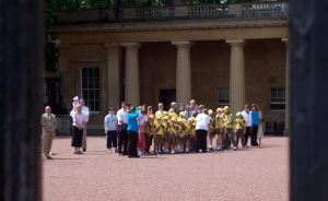
Group of British children (scouts?)

My brother won this hot dog hat when he correctly answered a trivia question (about hot dogs)

Yellow Orange

Advertisement for current fashion trends

Tyra Banks, LIFE Images

My cat..

Orange

Mascara Ad

“Jackson Family” LIFE Images

My friend Allison, happy after a Benglas victory.

Red Orange

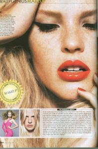
Make-up info in a magazine…the color of the lipstick stands out well with the rest of the colors on the page.

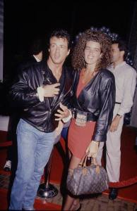
Someone with Sylvester Stallone LIFE Images, the colors are slightly dulled but her dress is still noticable red orange

My talented friend/co-worker Morgan made this awesome hot-dog cake for the annual O’betty’s hot dog eating contest.

Red

Magazine photograph

Red Light District,  France 2006

Perfect red bandanna for being a pirate

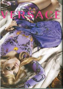
Red Violet

Apparently, it’s worth $500 to buy this fabulous suitcase.

“Trump Family” LIFE Images

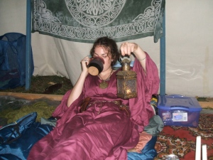
Medieval garb at Pennsic War, 2007

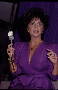
Violet

Magazine Ad

“Elizabeth Taylor, 1987” LIFE Images

Random paint spill on the sidewalk, corner of College and Mill

Blue Violet

Magazine Ad

“Kennedy Family” LIFE Images

Intertube

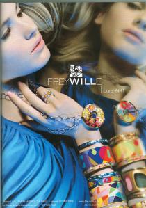
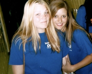
Blue

Magazine Ad

“Brooke Shields, 1983”  LIFE Images

Senior Follies

Blue Green

Magazine Ad

1981-2 LIFE Images

Piece of “Starry Night”

Green

Small ad in magazine

Mont St Michel

View down Fort St, from Grosvenor

Yellow Green

Magazine Ad, looks more yellow after being scanned..

Bath, England 2006

This picture is a little blurry but is a great yellow green.

The Values of Black & White

Out of the five that I took, here are three picture that I liked best.  I took them in color and then transferred them into black & white.

I like the unexpected color combination and the curvy pattern in this gown.  14 Values

For my second picture I chose a section of my Passion Works passion flower.  I love these flowers because of how vibrant they are and feature so many different colors, glitter, and hand-painted pictures.   20 Values

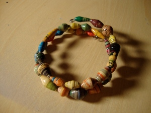
I love that each bead in this bracelet is so colorful but the differences are subtle when looked at as a whole.  22 Values

Hopes, Expectations, and Colors Galore

1.  Through this class, I hope to learn more about the relationships of colors with each other and how they work together to create such beauty in our world.  Everyone has opinions about which colors complement each other but I feel it is important to know what the standards are in order to be more effective.  I want to be able to use colors in new and interesting ways to create clothing that is instantly appealing.  I want to learn how colors affect mood and setting to better create costumes that blend perfectly with the rest of the scene.  Whatever I learn, I expect it to be great knowledge for my future.

2.  Initially, the only similarity I see between the images of Goethe and the color wheel is the pop of so many colors.  The color wheel looks like a simplifyed version of the rainbow in color order that is  spun in a circle – one color slightly fading into the next.  As far as Andy Warhol’s Goethe goes, I’m really not sure about the intention.  There are definitely many different color combinations, some more pleasing that others.   For example, the image at the top right is my least favorite because there is not much dimension and the red is quite overpowering.  But, each image seems to draw the eye’s attention to a specific part of the image, showing how powerful colors can be.